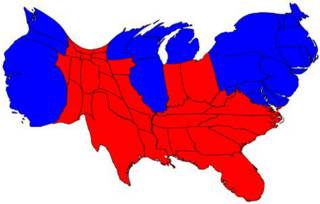
My, What a Large Florida You Have....

Since I'm nuts about maps, here is a really interesting cartogram showing the distribution of "red" and "blue" states by population size. (I swiped this from Talking Points Memo, FYI.) Essentially it shows that, when it comes to actual people, we (the "blue" voters) are not as outnumbered as it might seem by looking at an electoral map. This graphic and several others like it can be found at a site run by (I assume) University of Michigan grad students, which includes a number of other ways to look at this data. For example, maps that show results by county demonstrate that most of California is "red" (as anyone who has lived there can tell you) and that many urban centers in the south are "blue" (as someone who lives there now can confirm). Another map on that page displays results in red, blue, or purple, depending on the percentage of demo/repub votes in each county. In that one the country looks mostly purple -- kind of like a bad bruise -- with only intermittent splotches of pure red or blue. Finally, a cartogram of this data sorted by county population looks completely freakish, like something you'd see in a nightmare. Somehow that seems wholly appropriate.


0 Comments:
Post a Comment
<< Home